At LimeCuda we are often handed web designs by graphic designers or marketing / branding agencies. We then implement these design specs into a fully-functioning website. We love working this way. It is even better for everyone if they hand us all the specifications up front for us to implement.
What follows is our attempt to describe what we need specified. We often call this the “kitchen sink” – which comes from the old idiom “everything but the kitchen sink“. In this case we want everything (the sink) specified. Colors, sizes, padding, effects. The more precise, the better chance we nail the vision first try.
The following gives a great starting point for the global styles that effect all pages on a website.
Colors
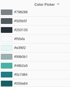
These might be colors for:
- Text
- Backgrounds
- Buttons / links / CTAs
- Borders / lines
- Inputs / Form elements
There may be shadings in between the colors too. Sometimes there is a “brand-blue” and a “light blue” and there could be shadings in-between.
Typography
We need to know…
-
- Font Families. As best practice we usually specify a font-stack as well so if the first one isn’t able to be used, the design degrades gracefully.
font-family "Helvetica Neue", Helvetica, Arial, sans-serif - Font Size – best specified in px as the perceived size varies by font-family
- Colors – in hex preferably.
- Misc: any special rules for:
- Case (upper / lower)
- Letter-spacing (AKA kerning)
- Line-height
- Font Families. As best practice we usually specify a font-stack as well so if the first one isn’t able to be used, the design degrades gracefully.
To provide treatments for…
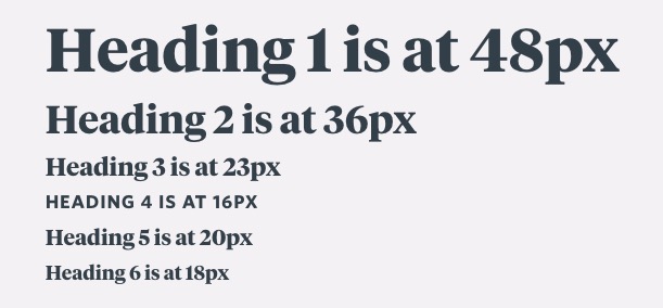
Headings, body copy, links, bold, italics, quotes pull quotes, highlighting of text
Buttons
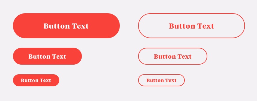
Usually this is as simple as a solid-color-filled primary button and a more subtle button with just an outline (often called a ghost button)
Typically we create small, medium, and large button styles in both primary and secondary (like below)
Forms
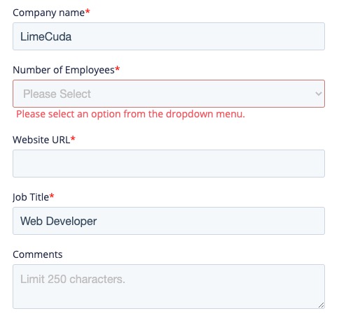
This is probably the most challenging piece to design as there are so many variables. It can be helpful to start with a system where someone has already done the hard work of determining all the attributes.
- Text fields, dropwdowns, radio buttons, checkboxes, multi-selects, sliders, error messages, required fields, etc.
Lists
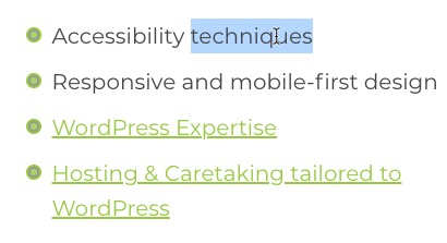
- Unordered lists (bulleted lists)
- Possibly checkmark lists
Spacing and Gutters
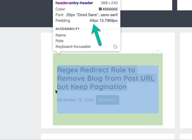
Real World Example
Here is the start of a small example of a style spec that would be very easy for us to understand and turn into global web styles…
Body text is:
- color: #666666;
- font-size: 20px;
- font-family “Droid Sans”, sans-serif
- line-height: 1.2em
Headings are:
- color: #333333;
- font-size: 13px for the H6 and stairstepping up (golden ratio) 16 (h5), 20 (H4), 26 (H3), 33 (H2), 42px (H1)
- font-family “Helvetica Neue”, Helvetica, Arial, sans-serif
- line-height: 1.2em
- font-weight: 700;
- margin: 80px 0 10px;
Good screenshots that accompany something like the above serve as great double confirmation for us.
Leave a Reply